9.29.2014

The People of Clyde Common, Portland

While I most often draw subjects that are architectural, or urban, or even landscape-oriented, and I go to figure drawing sessions as often as time permits ... I don't often draw people in public places - buses, cafes, bars and the like.  
 However, after my recent trip to Brasil for the 5th International Urban Sketchers Symposium, where I found myself surrounded by artists who are more or less constantly drawing the people around them ... I've been inspired to follow suit more often.  


So here are several of my efforts from my recent visit to Portland, completed in a few evenings of having drinks at Clyde Common. This is an award-winning bar that has been managed for the past several years by an old friend of mine, Jeffrey Morgenthaler. Unfortunately, he was out of town during this visit, but that just left me with more time to sketch. 

Drawing in bars and cafes like this is obviously a time-honored tradition among urban sketchers, but it's relatively new to me. I must say, though, that it's a fantastic conversation-starter. Of course people are curious about what you're doing and why you keep glancing briefly in their direction, and when they see even a halfway decent representation of themselves, it seems to really pique their interest. 
 I also did a fair amount of journal-writing, occasionally having some fun with the formatting of the page. In this case, the people were basically a composite image - I sketched various individuals and people in the background as though the bar was much longer and more crowded than it was in reality. A fun exercise, just like all the people-sketching I did over the weekend.

A Few Architectural Moments in Portland

I spent a few days in Portland guiding a field trip, and managed to do a fair amount of sketching while there. It's always nice to go back to this city, because each time I seem to discover new places or to see familiar places in a new light. The city is also full of memories for me from the 1st International Urban Sketchers Symposium back in 2010 ... I still almost can't believe that so many sketchers from around the world descended on this city and started a phenomenon that has only continued to grow. Anyway, here are a few of the drawings form my visit - this first post will focus on buildings, and will be followed by a post about drawing people. [All these drawings were done in a Stillman & Birn Gamma Series 9" x 6" Landscape sketchbook.]

  This is the Federal Reserve Bank Building by Pietro Belluschi, 1949. A very sleek facade and selective use of stone cladding ... one of my favorite buildings in the city.
 The Governor Hotel, East Wing, designed by William C. Knighton in 1909. A very curious building, with highly unusual details at the cornice - anthropomorphic and/or robot-like 'sentinels' in glazed terra-cotta.
 Converted railway loading docks at NW 11th Avenue between Hoyt and Irving. I stopped to sketch here with my students, who are currently studying various housing typologies. This little stretch of street shows what can be done with existing industrial infrastructure - it's a very pleasant space, and I imagine the interiors are nice as well.

 A simple courtyard on NW 19th, immediately adjacent to The Commissary Cafe, a beautiful little space where I got my morning coffee.
And finally, "The Indigo" ... this is a building we visit each year for a tour of ZGF Architects, who designed the building and have their office here. I've always loved the way this building reflects the sky, and that's the main point I was trying to get across in this sketch. It was a struggle, as I'm still getting used to the paper in the Gamma Series sketchbook (watercolor behaves quite differently on this paper as compared to the Moleskine I've been using most recently), but I'm glad I made the effort.

7.09.2014

Light in the Portico of St. Peter's

Yesterday I met my students for sketching class in Piazza di San Pietro, with its portico designed and constructed by Gianlorenzo Bernini from 1656-1667. They were sitting on the steps just inside the piazza while I talked about the variety of potential sketching subjects we could tackle, and some strategies for dealing with the complexity of the place. I mentioned how focusing on just a small portion of the portico can be a good antidote to feeling overwhelmed, and, as I said this, I noticed some beautiful light and shade in the colonnade behind the group. So I decided to demonstrate what I'd just been saying, and focus my attention on this relatively simple scene, trying to capture the gradations in light and dark, and trying to render the volume of the columns in a convincing way. A little later, Chris Kerins, who I'd had the pleasure of meeting at the first USk Symposium in Portland, walked up to say hello (he and I had communicated about this a bit, so it wasn't a complete surprise). Chris had his group of students sketching there as well, and we did a brief show-and-tell with the two groups. A nice morning spent in an amazing place!

7.07.2014

The Angel of Grief in Watercolor

Drawing sculpture is something I've been enjoying more and more over the past several summers of working here in Rome. With some of the most amazing sculpture in the world collected in the museums and churches, and also scattered around the city, there's always 'someone' who will hold a pose for as long as you like, and those poses are most often rather dramatic. In drawing sculpture, as with most subjects I find especially challenging, I typically prefer to use graphite, which makes it easier for me to find my way into the drawing slowly, to map out the lines, curves, and forms of what I'm seeing. For reference, some examples can be seen here. But on an afternoon last week (after a long walking tour of the Testaccio neighborhood guided by my colleague, Tom Rankin), I decided to try watercolor.
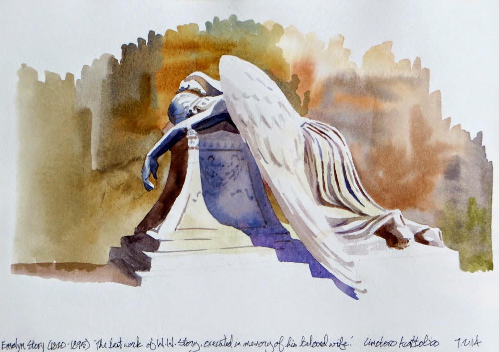
I was in the Cimetero Acottolico, otherwise known as the "Protestant Cemetery." This is where you would have been buried if you happened to die in Rome and you weren't Catholic. So it's quite a who's-who of foreigners who lived in Rome - there are Keats and Shelley, Antonio Gramsci, Hendrik Christian Andersen, Chauncey Ives, Gottfried Semper, Gregory Corso ... the list is long and the funerary monuments greatly varied. But perhaps my single favorite tomb there is the "Angel of Grief," the final work of American sculptor William Wetmore Story, carved for his wife, Emelyn. There are numerous other versions of this sculpture but, as far as I know, this was the first. It's such a dynamic sculpture that it's difficult to find the best point of view for a sketch, but there's something about the angel's drooping hand that I found appealingly expressive. Also, the shadows were most interesting on this side at this particular time of day. The sketch needed some background, if only to give form to the upper part of the wing, but I'm glad I made the decision not to get into drawing plants and other tombs - I figured these might distract from the sculpture. It was really a nice drawing experience - quiet, peaceful, contemplative - and I look forward to drawing at this location again.

6.19.2014

Graphite Finds Form on the Gianicolo

 This morning we had our sketching class on the Gianicolo (aka, Janiculum Hill) here in Rome. When I'm working with my students during our sketching sessions, I almost always use graphite - it's clean, fast, expressive, and extremely easy to use. It's easily the best medium to work with when you want to find form in a gradual way - light lines that search for the correct angles of perspective and relative proportions, followed by broad, strong strokes that define shade and shadow. The 'set up' for this sketch of the Acqua Paola only took about 10 minutes. I then made my way around to the students to show them how I had laid things out, and to give instruction on their works-in-progress. After I had talked briefly with each student, I had only about 20 minutes to add value to my drawing - so there was no time to get distracted by the small details; it was all broad stokes of darkness and midtones. From here, we walked down the hill to San Pietro in Montorio, home of the perfect little building known as the Tempietto, designed by Donato Bramante around 1502.

Here we worked on an exercise - one I learned from my sketching teacher almost 30 years ago - for finding the form of this 'simple' little building. In practice, these sorts of subjects - ones that appear simple on first glance - often create the most trouble. We typically try to draw every detail without first finding the overall form and proportion. By focusing on the elliptical forms of a circular structure seen in perspective, we can get a much better handle on the overall geometry of the subject. So I have my students draw in a continuous spiraling motion, really using their arms rather than their fingers. Perhaps 10 or 15 minutes of this exercise usually leads to more accurate proportions and less focus on detail.


We ended the day with a sketch of the equestrian statue of Giuseppe Garibaldi. Perhaps the ultimate challenge in 'finding form' - at least for a group of architecture students - is to draw human and animal figures. Our brains tend to over-analyze or objectify the subject, and get in the way of what our eyes are really seeing. So this was an exercise in seeing line and form, and trying NOT to draw a 'person' on a 'horse.' All in all, it was a wonderful morning of walking, sketching, learning, and enjoying yet another day in the Eternal City.


6.18.2014

A Few Days in Atrani

Our group from the University of Idaho made a visit to the Amalfi Coast over the weekend, staying three nights in the small town of Atrani and a day at the Greco-Roman city of Paestum. It's always a bit of a challenge coordinating travel for this trip, as I prefer to use public transportation and the rail/bus/boat schedules rarely align the way I'd like. There was only one real glitch - we went to transfer from one train to another in Napoli, and got on the train that was sitting on the designated track ... only to discover a bit later that the actual train had been sitting further down the same track, and had already left the station. Crazy. So we had to kill an hour or so waiting for the next train. In the end, not such a big deal, as the destination always renders insignificant any difficulties along the way. While I hate to give away what I feel is a bit of a secret ... Atrani is a wonderful place, and one of my favorite locations for drawing. MC Escher spent time there, which becomes obvious when you see his initial "Metamorphosis" woodcut and also consider his images of never-ending stairs and crazy perspectives.

And then there's Paestum, just a little way down the coast from Salerno, where we take the bus or boat to get to Atrani. Paestum was a Greek colony from the 5th Century BC that was subsequently made into a Roman city before falling to the Saracens in the 9th Century AD. It then lay all but undiscovered until the 18th Century when it became inspiration for English Romantic poets. Now, it is simply a magnificent place to visit, with three major Doric temples in immaculate condition. They make challenging subjects for drawing, and in this case I was trying not to get worked-up about the details and let the paint flow freely.

Then it was back to Atrani, where we had nice weather interspersed with some intense storms. We all stayed dry until we got off the boat in Salerno on the way home - in the 10 minute walk/run to the train station, we all got drenched in a heavy rain. But it was ok ... we were going home, to Rome, where warm showers and dry clothes were waiting. We're almost halfway through our two months here, with lots more to do and always more to see and sketch.

6.02.2014

Roma, ancora una volta

I'm back in Rome again, for another installment of the annual University of Idaho Architecture study abroad program I created back in 2007. It's been a little over a week, and I'll be here for a couple more months. Most of my time is spent working with students, but of course I find time to draw on my own as often as possible. I'm trying to work on my watercolor skills, working in a Moleskine A4 Folio for the most part - sometimes doing single pages and other times taking advantage of the landscape format by doing full page spreads for wide panoramas or very vertical subjects. But I'm also enjoying graphite again for the first time in a little while (last year I did relatively few drawings in pencil). Graphite doesn't have quite the visual impact as watercolor, but it's certainly quicker, easier to work with, and the focus is almost exclusively on value rather than color. More can be seen on my flickr page. It's good to be back!

4.25.2014

WSU Sketchcrawl

Last Sunday I had a great time connecting with Gabi Campanario, Frank Ching, and Gail Wong as they were wrapping up their workshop "Line to Color" at Washington State University. The workshop was organized by Associate Professor Bob Krikac, and he and I talked about the possibility of hosting a similar event next Fall between both WSU and the University of Idaho. Hopefully we can make something happen. Anyway, last Sunday was a beautiful day for a sketchcrawl, in part of the campus that I had never really explored before. I didn't have a lot of time for this sketch, but it was a lot of fun to take on the challenge of a reasonably challenging subject in an hour.

3.17.2014

Washington, DC

I've just returned home after a week in the nation's capital, where I was guiding a group of 17 students on a field trip. We did a lot of walking, museum visits, and stopped by a few architecture offices. The day prior to the start of our touring, I did a quick sketch of Dupont Circle ... one of my favorite places in the city. Long ago, when I lived in DC for about five years, I worked in this part of town. So Dupont was a regular lunch spot for me on nice days. The central fountain was designed and sculpted by the same two people who did the Lincoln Memorial - Architect Henry Bacon and Sculptor Daniel Chester French - and was completed in 1920.


When we had finished our touring, I had a free day to myself, so I got down to the Mall and took on a few more substantial subjects. The wind made sketching a bit of a challenge - I was working in a Moleskine A4 book, and did my best to secure the pages with rubber bands while I was trying to paint ... but it was tricky, and I probably gave up a little earlier on these than I would have on a calm day. The first is the Washington Monument, followed by the Tidal Basin with the Jefferson Memorial on the right, and finally the Lincoln Memorial.


2.21.2014

Thomas Schaller Watercolor Workshop

I recently attended a fantastic workshop at the Fallbrook School of the Arts, in Fallbrook, California. It was taught by Thomas Schaller, who has long been one of my 'heroes' with regard to architectural illustration, and who for the past several years has turned his attention - and his formidable skills with pencil and brush - toward fine art watercolors. The workshop was titled "The Architecture of Light," which seemed to be right up my alley, so I was eager to participate. We spent four days together, mostly in the studio, watching Tom work and listening to his observations and thought process as he created a series of very instructive demonstrations. We followed each demo with our own attempts to incorporate his techniques.
It would be impossible to describe everything Tom talked about, and demonstrated, in the four full days of the workshop. I'll just summarize a few things that really appealed to my own sensibilities regarding watercolor. First, the workshop really confirmed my growing understanding that value is far more important than color. I don't mean to say that color is unimportant, but it is a secondary consideration, while value contrast is primary. To maintain clear value contrast, the lights must be carefully retained as the white of the paper. As Tom put it, watercolor is a subtractive process - every layer of pigment subtracts light from the image. So it's very important to identify the lights and darks while composing things - which was done in every case with a soft graphite pencil in a separate sketchbook.
Another revelation from the workshop was seeing the sheer volumes of both water and pigment Tom used in applying washes. Most often, he would keep the washes wet (occasionally using a small spray bottle) long enough to drop in additional pigment, or so that one wash might be allowed to bleed into another one (strategically, for the most part). There were often times when water was running off the page, but the wash could be 'recharged' with additional pigment as long as it remained wet.


There were many other techniques that I found very helpful, but I'll just mention one more. Not a 'technique' as much as an approach, I guess. It has to do with knowing when the reference (i.e., the subject or the view) has provided enough visual information, and when to stop being too much a slave to 'reality.' As Tom put it, and I'm paraphrasing here, 'at some point, you need to start listening to the painting ... what started as an interesting view is now a world unto itself in the image you are creating.' He advocated finding a 'story' that you're trying to tell, and developing both the composition and subsequent painting to most effectively tell this story - and if that means editing the components of the view, so be it. This is very different than my typical approach to sketching from observation, where I'm most often trying to be faithful to what I see ... but I found this idea of storytelling and listening to the painting to be both refreshing and challenging at the same time. 


Everything we did in the studio was from photo references. We had just one day of reasonably nice weather, so we headed out to work on-site at The Grand Tradition Estate and Gardens, a beautiful place that seems to be primarily devoted to hosting weddings. Perhaps this doesn't technically qualify as urban sketching - it's leaning more toward rural - but it was certainly sketching on location, unlike the work done in the studio. After Tom did an on-site demo, focused more or less on representing skies and water, I tried the same subject seen here. The goal was to create a clear center of focus at the gazebo by emphasizing the contrast of light and dark in this area of the image. The trees at left needed to be dark enough to create an anchoring frame to the composition, but not so dark as to compete with the focus at right. I was also trying to incorporate a wet-into-wet technique to blur the division between the sky and the trees, and was experimenting with ways to indicate the reflections in the pond. After finishing this sketch, I ventured into the semi-tropical forest in the background. Paved paths wandered among palm trees, flowers, and waterfalls, which I tried to capture in a very quick sketch in my Stillman and Birn Gamma Series sketchbook.

It was a wonderful week of painting and learning, and it will likely take some time to fully process all that I experienced. But many thanks go to the Fallbrook School of the Arts for hosting, and especially to Tom Schaller for being so generous with his time and advice. If he is ever doing a workshop near you, I can't recommend it strongly enough!
 
Creative Commons License
This work is licensed under a Creative Commons Attribution-Noncommercial-No Derivative Works 3.0 United States License.